
The one in the middle has some different modules on it.
Given that I need to spend some time playtesting the Jump War, this will probably be the last workbench for a while. And since I’m covering much the same ground as my previous one, this one will fill in the gaps more.
In the above picture, there are three of Brigade Models‘ Modular Container Ships. The outer two are mostly normal configurations, while the one in the middle is a Modular Armed Merchant Cruiser. I’ve included it to show the state the ships were in when I decided to repaint them: a black base coat with silver drybrushing.

Fresh out of the factory!
Here are the container ships in pre-labeling state. Again, Brigade’s ships go from dull metal to playable very nicely, with the right coats of paint. If I were not crazy, I’d be perfectly happy to put these on the table right now.

All work and no play makes Jack a dull boy.
But I am crazy. Here’s a shot of my area, with a close-up of the work I put in to correctly render the font that the Maersk Line uses. Even with all that practice, it took me two tries on the actual model.
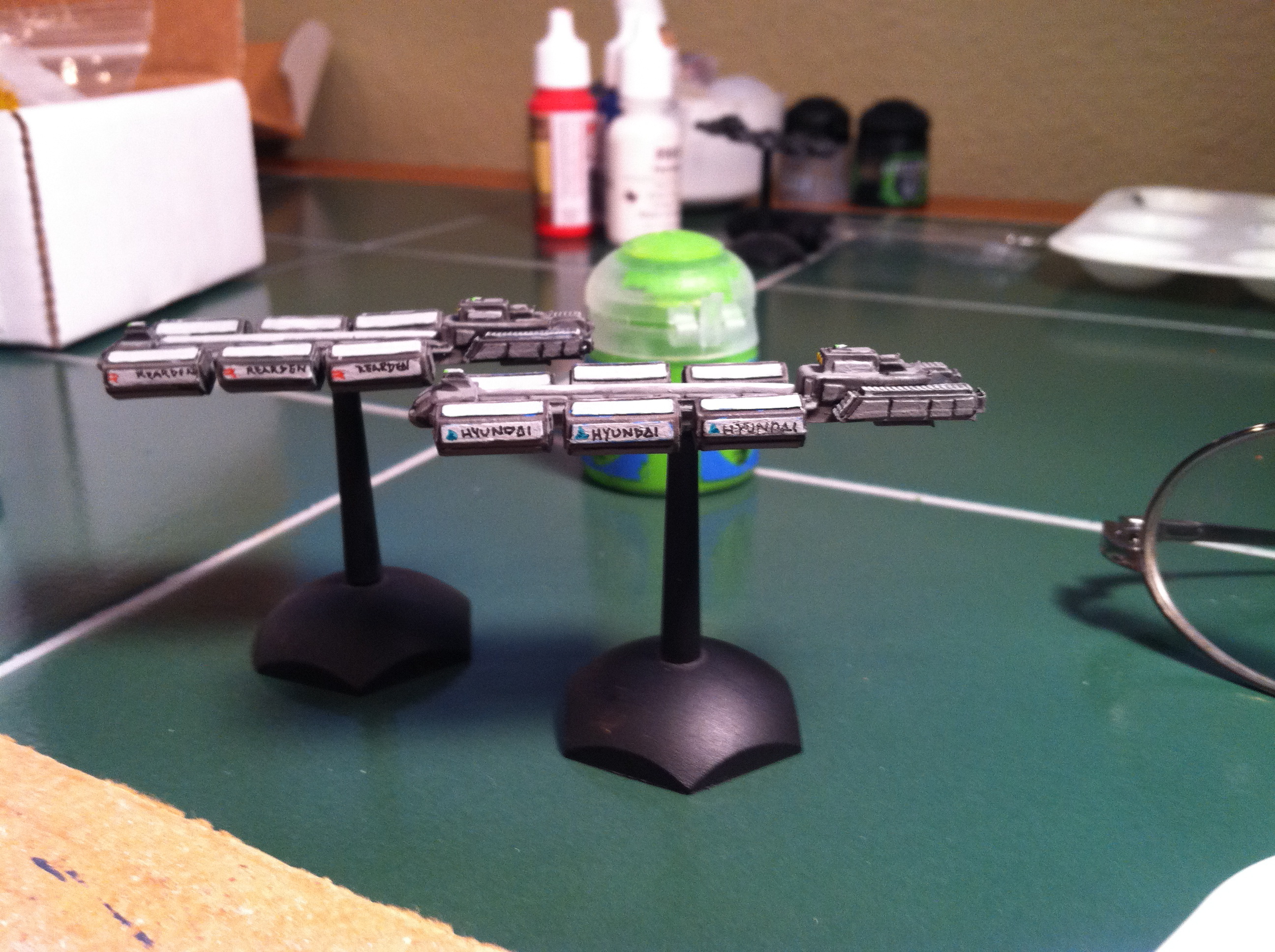
Container ships, operated by the Hyundai Group and Rearden Commerce.
Here’s the result. Because the models invoke “train” in my heart, I would’ve liked to have painted the front of the ships like locomotives. Unfortunately, the only good spot to do that is on the underside of the ships, where no one can normally see the work.
So I went back to maritime shipping containers — this time, with the world’s easiest to paint: Hyundai!
And cheated. That was all done with Micron pens. One of these days, I’ll bother to learn how to make decals. Doing one logo is reasonable; six on a ship takes a special painter to be consistent.
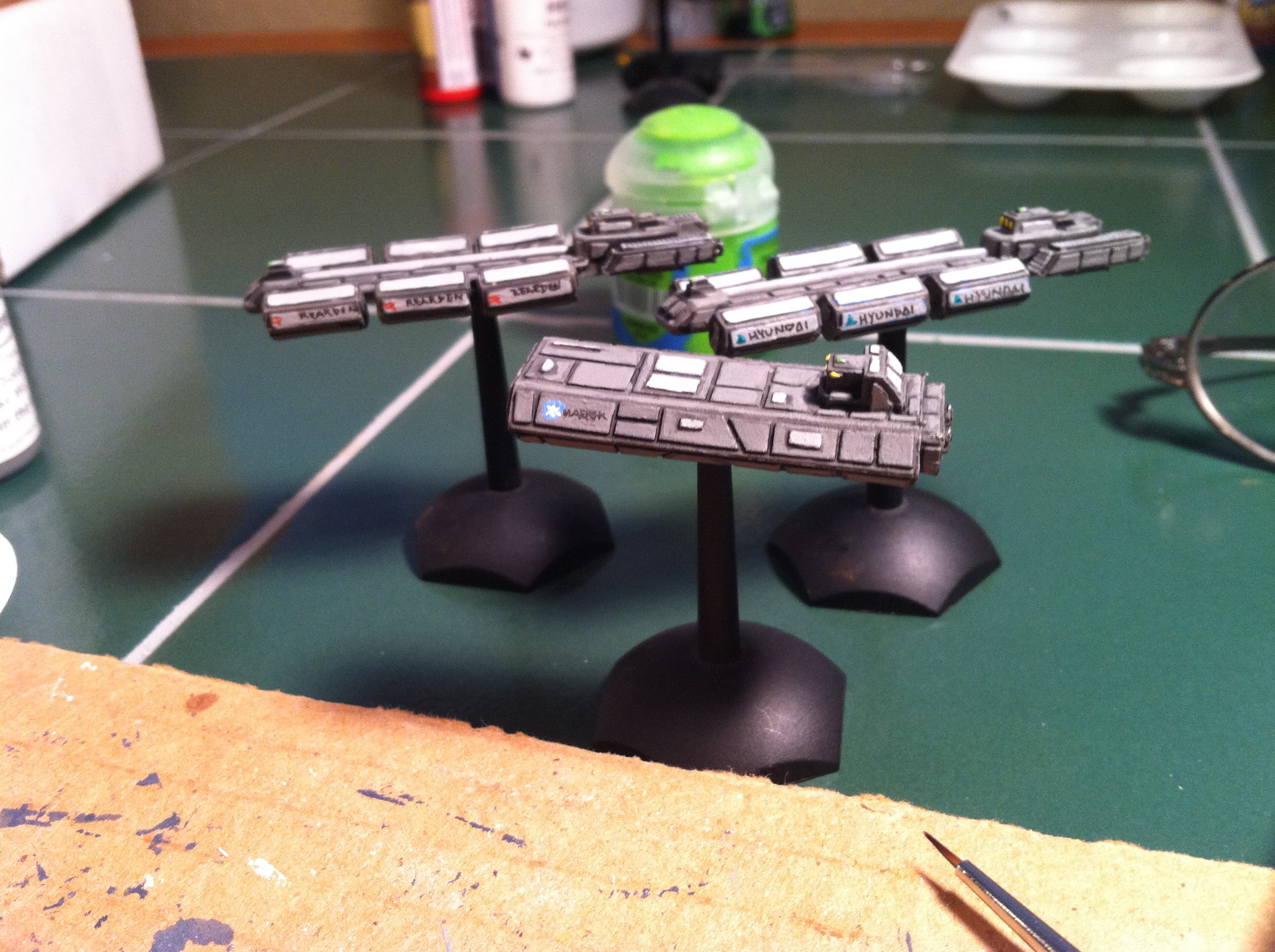
Return of the Maersk.
And remember how I was saying I couldn’t get a decent picture? Well, it turns out it’s not the Microns — it’s the contrast. The Maersk logo was drawn on the middle shade of that grey triad, while the container ships’ logos went over the light shade of the triad. More contrast means better resolution.
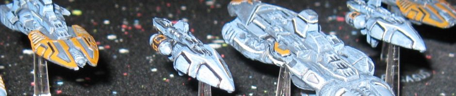
No wonder Hollywood is enamored of blue and orange.

This might be the new masthead.
Oh, and about those models …
Each container ship is actually four pieces: the main ship that runs through the center of the containers, plus three pairs of modules that straddle the ship. If you wanted, you could mix and match the container pairs with turret pairs on the same ship. The fit is a little loose, but not really noticeable, as the joins are hidden under the ship.
Also hidden is a big glob of putty to hold the flight stand in place. The holes for the bases aren’t quite right, and the vessels are so thin that I didn’t want to accidentally drill through them. On the bright side, these are light enough that everything holds nicely enough.
Again, 4/5.